Jefferson Parish
Identity and brand guidelines for the governing body of Jefferson Parish, Louisiana.
Jefferson Parish is a county in southeast Louisiana, commonly referred to as "JP." Commissioned by the Parish and Jefferson Chamber Young Professionals, they were seeking a new identity that would be a modern, progressive representation of the Parish for future generations. Deliverables included a suite of primary & alternative marks and brand guidelines.
- Client
- Jefferson Parish
- Agency
- Deep Fried Advertising
- Active
- 2020-2021
- Role
- Lead Designer
- Work
- Branding
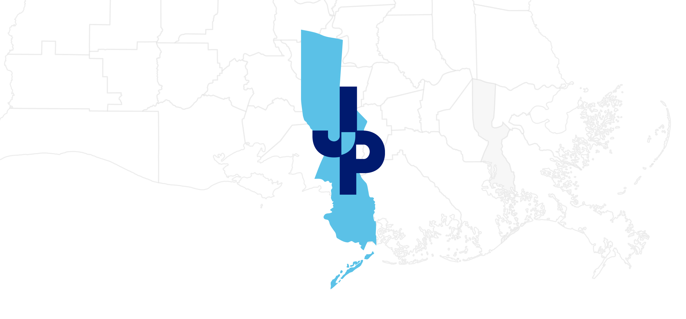
The elongated JP mark is an abstract representation of the geographical vertical shape of Jefferson Parish. The overlapping letters represent the East and West banks. The intersection of the letters is the Mississippi River that connects the two banks together to unite both communities into one parish.
The primary logo is the standard identity for the Parish as a whole. Whereas "State of Louisiana" is the mark for JP, individual government offices & services are typeset in its place to create a universal system for all the departments within the parish.
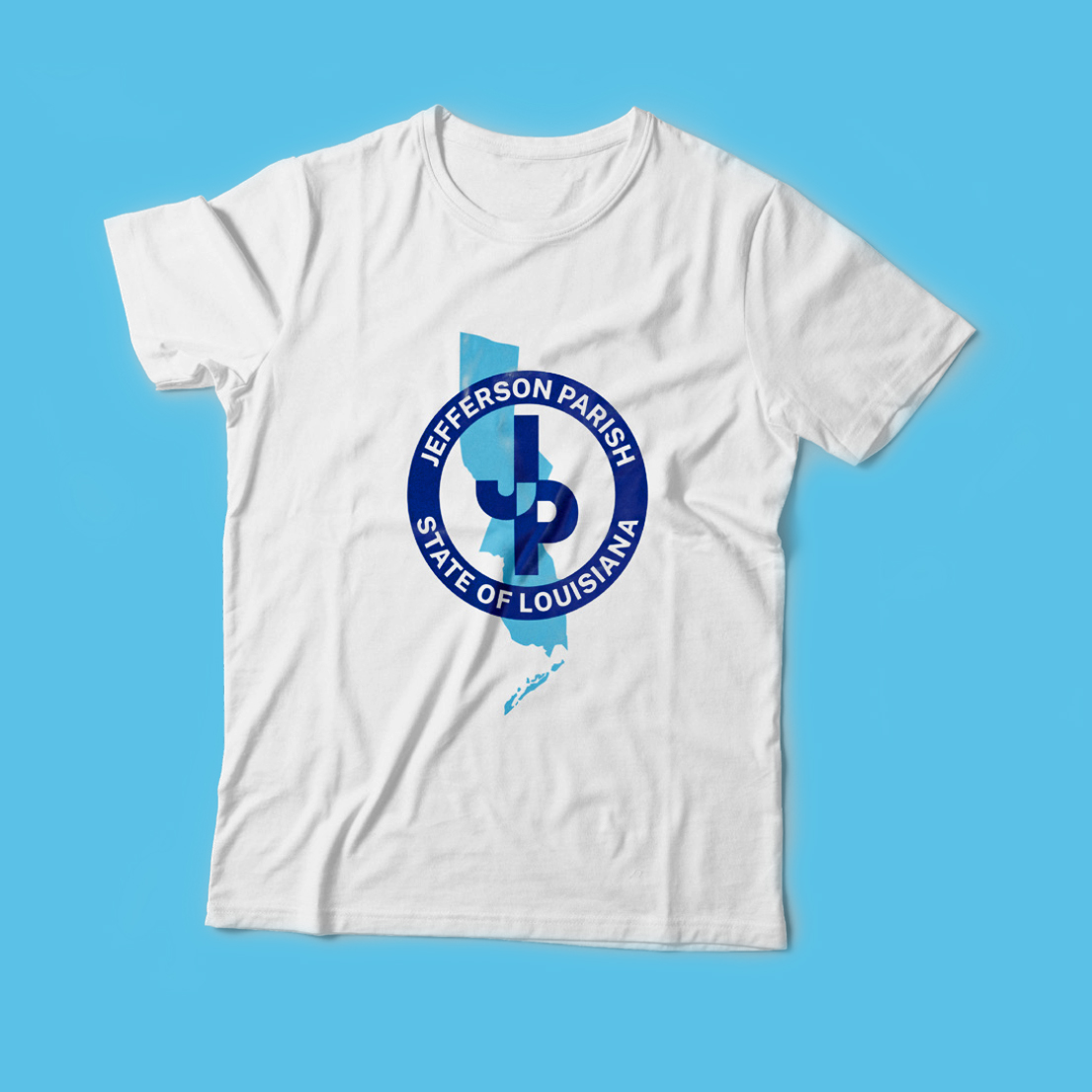
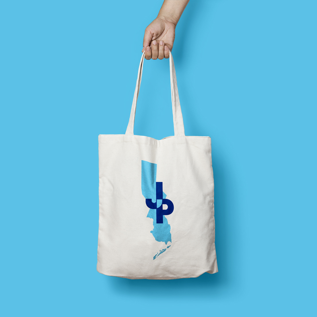
The alternative set consists of badges and marks that are more literal representations of the political boundary of the parish. These additional logos were created for promotional items.
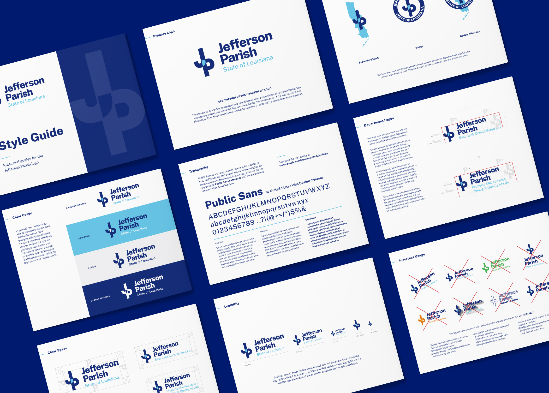
To coincide with this full suite of logos, I developed a comprehensive Style Guide to bring all the elements together and inform how each should be used.
